Kick Point helps people do better marketing.
Everything we do for our clients and partners is based on our brand values. We are:
Vocal
Intelligent
Collaborative
Ambitious
Reliable
Our brand voice and visual identity support these values and guide our communications.
Do Better.
We use this vision statement internally. On our website and in client communications, we refocus it to “We help you do better.”
It’s no secret that the barrier to entry for our industry is the ability to register a domain name — anyone can start a marketing company. We choose to do better marketing because marketing needs to be better.
We do better marketing by focusing on our clients’ clients and customers. Research comes first and implementation decisions must be matched with accurate methods of tracking success. Goal setting isn’t an exercise coated in optimism and hope, it’s a pragmatic tool used to plan how we’ll get someone from where they are to who they can grow to be.
We make marketing better by constantly pushing, growing, testing, and learning. We develop presentations about Local SEO, Brand Strategy, and Marketing Analytics that are delivered around the world. We’re ahead because we budget for training and conference opportunities that make sense and encourage each other to try new things.
Voice
Our brand voice is an expression of who we are as a brand and guides how we communicate with each other, clients and potential clients, industry peers, and the loyal person who responds to our newsletter (hi, Doug!).
Brand voice:
- Ensures consistency between writers.
- Builds familiarity and establishes trust.
- Shows clients that we practice what we teach.
Our voice is made up of four characteristics:
Insightful
We understand marketing and peoples’ relationship with it, and we use this insight to help our clients solve problems. We distill data into insights that help us and our clients understand what motivates people to make decisions. We don’t just share information, we explain why we’re sharing it so our followers take away the right message.
We are not careless, superficial, or reckless.
Strong
We are direct. We are clear. We are authoritative, without being aggressive or imposing. We don’t say or do things that we can’t support with clear rationale. We push back against misguided choices, say no when no is the appropriate answer, and are steadfast in our commitment to being a respected influence in the marketing industry.
We are not passive, fast and loose, or ineffective.
Candid
We are frank and sincere — if a client is facing a huge deficit, we will not sugarcoat it. If something didn’t work or breaks, we’ll be open about it and get to the bottom of “why”. We’re straightforward, which sometimes manifests as sarcasm (especially on social media and especially when we see websites with the title tag of “Home”). We are honest and impartial, and though we do serious work, we do not take ourselves too seriously.
We are not boring, insincere, or deceptive.
Helpful
We are smart and share our intelligence. We note when things are worthy of a bookmark and red flag content that is unfairly disguising itself as reputable. We amplify marginalized voices and support our peers and colleagues. We don’t hold back: if we can help, we help. When all a person needs is a helpful push toward the right answer, we are happy to give that encouraging shove instead of selling, selling, retaining, and then selling some more.
We are not guarded, discouraging, or adverse.
Footnote:
Another thing that we are (though this hopefully is not a forever part of our brand voice), is uncertain of the right way to discuss our accomplishments. The balance between bragging, being humble, and the much-loathed humble-bragging is one we haven’t figured out just yet. This lack of clarity means that we don’t talk enough about the amazing businesses and organizations we are proud to partner with and win awards for.
We’re working on it and trust that we will figure out the “right way” together!
Our voice is a living, evolving thing — it’s not perfect and neither are we. We will always push ourselves to be better and do better.
It’s The Way That We Live
Advocate for our clients’ clients and customers.
Edit and be edited.
Do the work to be anti-racist. Learn, unlearn, reflect, and participate in our on-going anti-racist education and book club.
You aren’t a doctor or a locksmith. You will never have a pager. Marketing emergencies don’t exist*.
Admitting you don’t know something is often the first step to learning how to do that thing.
Find a potential solution to go with your “no”.
You’ll get frustrated. Growth is uncomfortable. Remember how much more you know now than you did last month, last year, or last decade**.
If you see something, say something†.
Find the definition of “vacation” that works for you‡ and the balance of what amount of vacation time works for you and your family.
Respect the process and be respectful when the process has to be reworked.
You are an educator. You teach clients how to do better marketing.
Be tidy — with your dishes and with your file names.
Please avoid using the following words: allow(s)/allowed/allowing, peep(s), wizard, guru, ninja, PS, super duper, yo, and next level.
* They do exist, but so rarely that they certainly aren’t worth worrying about.
** Technically Dana is the only one of us who has been at this for more than a decade.
† A fire, a typo, a tweet or blog post about something we all need to know about, etc.
‡ We reserve the right to enforce the suggested three week minimum vacation policy.
Logo
Our primary logo is a no-nonsense wordmark; it is the symbol that represents our company and is featured on all brand materials.
The KP icon can be used when the primary logo is not necessary, the space provided is too small, or in cases where our company name is already displayed in plain text (e.g. as our Instagram profile image, because our company name will be adjacent to it in plain text).
Colours

Made for the Screen
We’re a digital-first company, so our colour palette exists first and foremost in a digital environment — that’s why the hexcode of each colour is listed first!
Note: Although red is one of our primary colours, it is predominately applied to our logo only. The teal and light blue are used as the basis of designs for our branded materials.
Hexcodes for Copy/Pasting
Red #DB4553
Light Blue #3498D8
Teal #29D9C2
Printed Materials
All brand-related printed collateral should be produced on uncoated stock. The Pantone (spot) colours listed should be used (instead of CMYK process) for printing whenever possible.
Gradients

Vibrant colours; subtle gradients.
We use a spectrum of gradients within our designs for screen applications, with the green-blue variant being the primary gradient used. The gradients must always go from lightest to darkest colour.
To keep from being too garish, the gradients are created from tints of the same colour — do not stray from the hexcodes here!
Hexcodes for Copy/Pasting
Green-Blue #29D9C2 – #3498DB
Teal #55FFF2 – #29D9C2
Light Blue #64C9EF – #3498D8
Dark Blue #3498DB – #1C5379
Red #EF867B – #DB4553
Yellow #F9E772 – #F0CA3E
Purple #A684B3 – #6D4D7C
Typography

The wonderful (and free) Google Font, Nunito Sans, is our designated typeface. We use the Black weight for all headers and bolded text, and the Regular weight for all body text. (The text you are reading right now is set in Nunito Sans!)
Typographical Hierarchy
Our typographical hierarchy was designed for digital applications first, and uses the web-based terminology of H1, H2, p, etc. to discern what type style/size should be used and when.
The hierarchy follows a 1.333 (Perfect Fourth) type scale using 21px as the base size for the body (p) text. The size of each header style increases proportionally from the base size following the 1.333 scale.
Typography for Google Docs
We set up a typographical guide with a base size of 12px in Google Docs, with all the text styles defined and ready for us to use to take over the world.
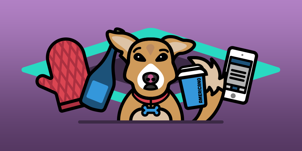
Illustration
Our illustrative style is minimal and two-dimensional. We use monoweight, thick black outlines on most elements along with a specific colour palette to give all illustrations a definitive and recognizable look. Reduce details to a minimum where possible, and use slight shadows to suggest depth.
Here are some guidelines:
- Human characters are always drawn with oversized heads and one eye bigger than the other, to inject humour into their look.
- When text is required in an illustration, use the Lost Type Co-op font, Cubano.
- Use rounded corners and rounded strokes whenever possible to soften the overall look of the heavy outlines.
- Gradients are only used for backgrounds.
Example Illustrations